VINTAGE RANCH Revamp
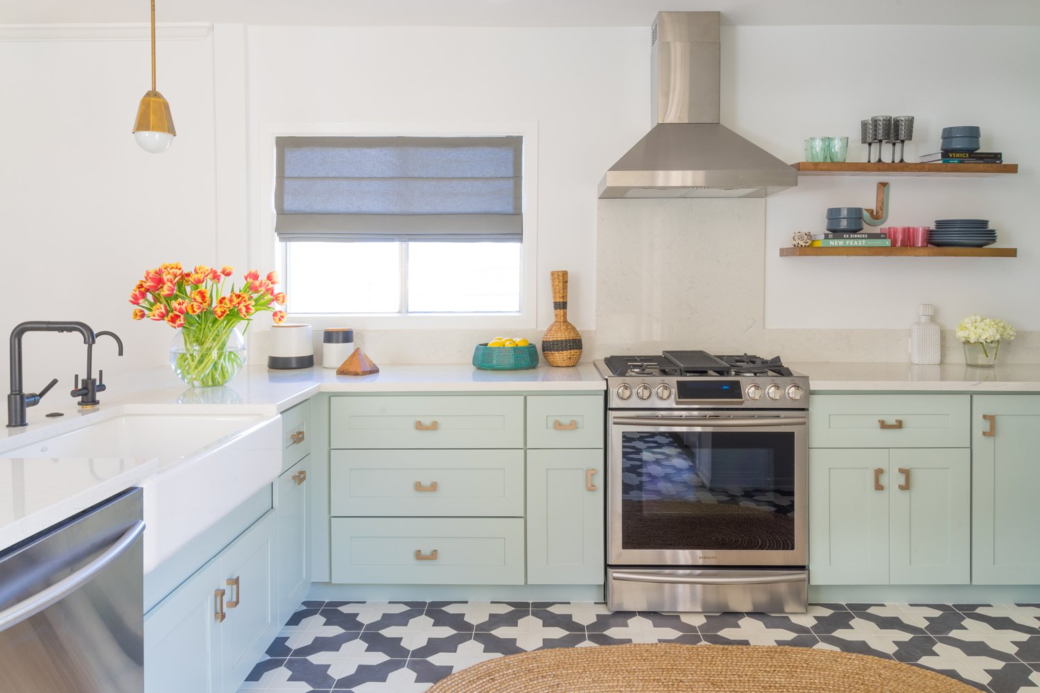
When we were asked to remodel a kitchen for a spunky young entertainment industry professional on one of our favorite shows, inspiration abounded. We knew it was the perfect pairing after she shared her love for pattern, color and antiques. Working with a strict budget, we totally transformed a depressing space into an unrecognizable, refreshing "after."

By integrating muted metallics and delicious pastels, we gave a dark and dated kitchen a whole new life that caters to modern sensibilities. The original layout felt cavernous despite decent square footage, so our solution was to replace the dividing wall with a peninsula and add French doors for better flow and loads of light.
Though the rest of the home boasts its original 1940's era hardwood, the existing kitchen had been equipped with less-than-appealing laminate. Since replacing the floors was a must, we took the opportunity to add a gorgeous graphic focal point. The cement tiles pack a punch of contrast and stay stylistically in line with the Spanish architecture of the home.
Though we'd never say no to neutral, rarely can we resist an opportunity to execute the unexpected. These cabinets offer a large canvas of color without feeling the least bit overbearing. To complement the subtle hue, we adorned them with champagne-toned pulls and stuck to a classic shaker silhouette.


